
Writing Task 1
20.02.2019 | Amrita ( Former IDP writing examiner)
SAMPLE 1
The chart shows the average number of hours each day that Chinese, American, Turkish and Brazilian tourists spent doing leisure activities while on holiday in Greece in August 2019.
Summarise the information by selecting and reporting the main features and make comparisons where relevant.
Write at least 150 words.
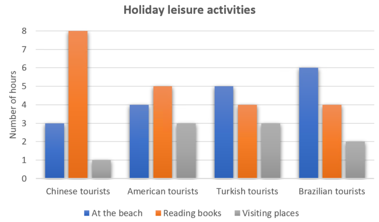
This bar chart illustrates the daily activities of tourists from four countries during their August 2019 holidays in Greece, focusing on beach visits, attraction exploration, and reading. Notably, reading books dominated their time, with Chinese tourists leading at eight hours per day, while Brazilians spent the most time at the beach, totaling six hours daily.
In terms of attractions, both Americans and Turks dedicated three hours each day, emphasizing parity in their preferences. Additionally, Turks and Brazilians allocated four hours daily to reading, forming a common ground. However, the Chinese surpassed them, investing double the time in this activity.
A striking difference emerged in visiting places, where the Chinese tourists spent the least time, totaling only a third of the hours dedicated by the American and Turkish tourists, who each spent three hours daily. This marked a notable contrast, showcasing how the Chinese group allocated their holiday time distinctly.
In essence, the chart elucidates diverse holiday preferences among these nationalities, highlighting a spectrum from avid reading to extensive beach indulgence, providing insights into how tourists from different cultures utilized their leisure time in Greece during the specified period.
SAMPLE 2
The pie charts below compare the proportion of energy capacity in gigawatts (GW) in 2015 with the predictions for 2040.
Summarise the information by selecting and reporting the main features, and make comparisons where relevant.
Write at least 150 words.
20.02.2019 | Arvind ( Senior IELTS trainer )

The pictures show how the amount of energy we use is expected to change in 2040 compared to 2015.
The big thing we can see is that the part of energy that comes from things like oil and gas is going down a lot. It’s supposed to almost double from 6.688 to 11.678 gigawatts, but its share of all the energy we use is dropping from 64% in 2015 to 44% in 2040. On the flip side, the charts say that the part of energy that comes from the sun, solar energy, is going up a bunch, from 2% to 18%. Wind energy is also supposed to go up more than twice, from 5% to 12%. Other kinds of clean energy, though, are going down a bit from 23% to 21%. Nuclear energy is expected to be 5% in 2040, a little less than 6% in 2015.
Even though we’re using less of the oil and gas kind of energy, it’s still going to be a big deal in 2040. But solar and wind energy are growing, showing that we’re moving towards cleaner ways to power things up.
SAMPLE 3
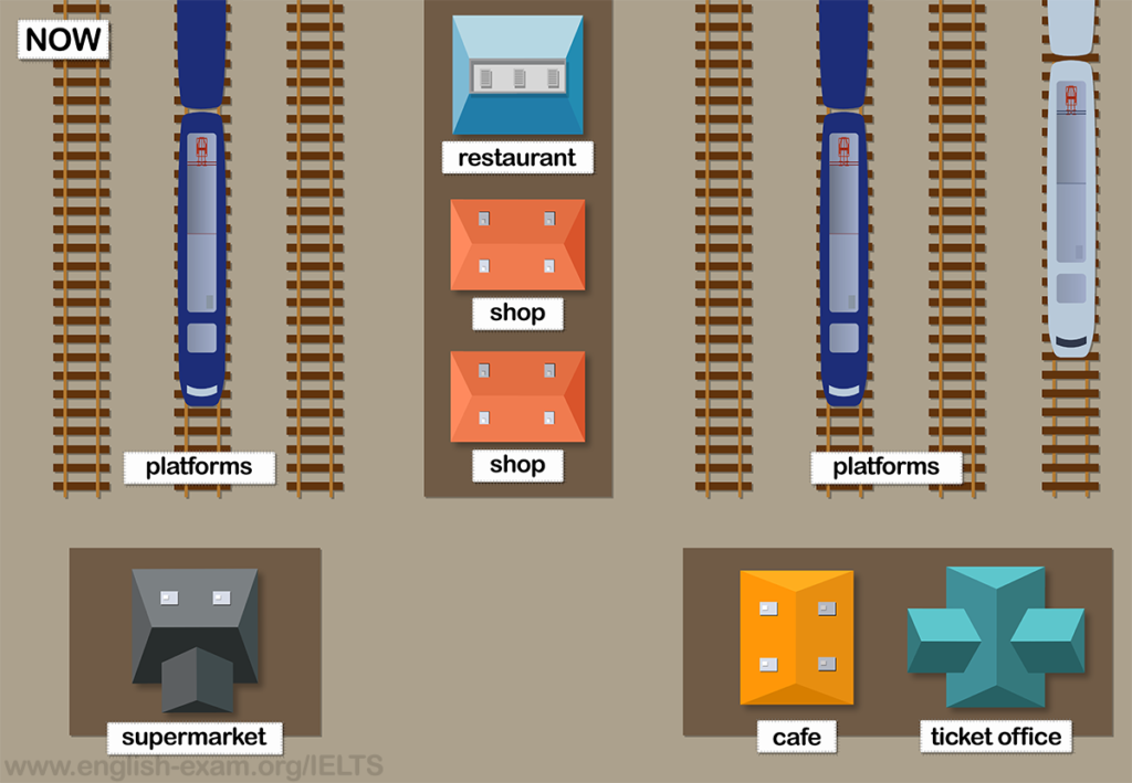
The maps show Pacific Railway Station station in 1998 and now.
Summarize the information by selecting and reporting the main features, and make comparisons where relevant.
Write at least 150 words.
20.02.2019 | Saumya ( Former British Council faculty)

The pictures show how the amount of energy we use is expected to change in 2040 compared to 2015.
The big thing we can see is that the part of energy that comes from things like oil and gas is going down a lot. It’s supposed to almost double from 6.688 to 11.678 gigawatts, but its share of all the energy we use is dropping from 64% in 2015 to 44% in 2040. On the flip side, the charts say that the part of energy that comes from the sun, solar energy, is going up a bunch, from 2% to 18%. Wind energy is also supposed to go up more than twice, from 5% to 12%. Other kinds of clean energy, though, are going down a bit from 23% to 21%. Nuclear energy is expected to be 5% in 2040, a little less than 6% in 2015.
Even though we’re using less of the oil and gas kind of energy, it’s still going to be a big deal in 2040. But solar and wind energy are growing, showing that we’re moving towards cleaner ways to power things up.
SAMPLE 4
The graph shows data about the annual earnings of three bakeries in Calgary, 2000-2010.
Summarise the information by selecting and reporting the main features, and make comparisons where relevant.
Write at least 150 words.
20.02.2019 | Pratistha ( IELTS trainer )

The graph shows how much money three bakeries in Calgary made from 2000 to 2010.
Bolo Cakery and Amandine Bakery earned more money each year, while Mari Bakeshop earned less. In 2000, Mari Bakeshop made the most money, but by 2010, Amandine Bakery earned the most.
For Bolo Cakery, they started with $20,000 in 2000, went up and down until 2006, and then went up a lot to about $65,000 in 2010. Amandine Bakery also started steady at around $55,000, then went up a bunch to almost $100,000 in 2008, and kept going up a bit to around $105,000 in 2010.
On the other hand, Mari Bakeshop made around $90,000 until 2004, but then went down a lot to just over $40,000 in 2008. After that, it stayed about the same for the last two years.
In short, Bolo Cakery and Amandine Bakery made more money over the years, while Mari Bakeshop earned less, and Amandine Bakery ended up making the most in 2010.
SAMPLE 5
The maps below show changes in the city of Nelson in recent times.
Summarise the information by selecting and reporting the main features, and make comparisons where relevant.
Write at least 150 words.
20.02.2019 | Amrita ( Former IDP writing examiner)

The two maps show how Nelson town has changed from 2000 to now.
In general, Nelson has become more modern, with more shops and transport options.
A big change is a new train line connecting the university to the town center. In 2000, there was no student housing, but now there’s a residence hall near the university. The old market in the west got replaced by new shops, and a new covered market was built on the other side of town.
The port area is now for pedestrians, with new entertainment places like restaurants and clubs. The northeast, which had lots of trees in 2000, now has a new shopping area after the trees were removed. A cool addition is a bike-rental program in the city center. Overall, Nelson has gotten more modern with better shopping and transportation, and there are new places for students, markets, and entertainment.
SAMPLE 6
The tables below show people’s reasons for giving up smoking, and when they intend to give up.
Summarise the information by selecting and reporting the main features, and make comparisons where relevant.
Write at least 150 words.
20.02.2019 | Pratistha ( IELTS trainer )
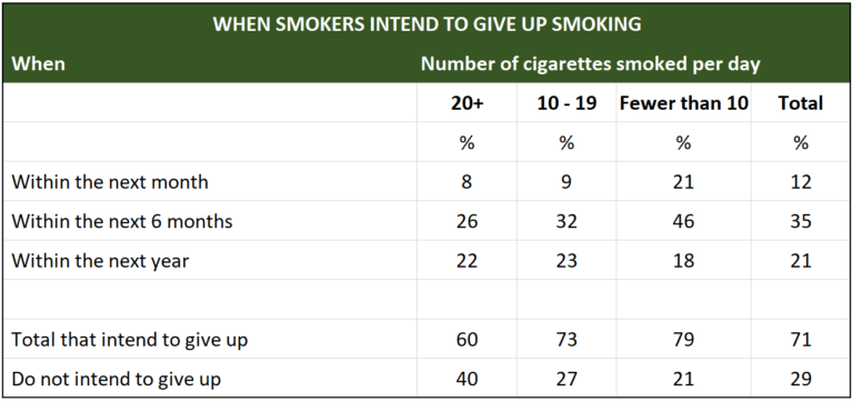
The two tables show why people decide to quit smoking and when they plan to do it.
Most smokers (71%) want to quit for their overall health. Money matters (31%) and the fear of smoking-related illnesses (25%) are the next common reasons. Notably, heavy smokers are almost twice as likely as light smokers to quit because of present health issues.
Looking at the second table, most smokers (71%) say they plan to quit, with a higher percentage for light smokers (79%) compared to heavy smokers (60%). About 35% aim to quit in the next six months, and only 12% are ready to try within a month. While 29% of smokers are not willing to quit, heavy smokers are nearly twice as unwilling as light smokers, likely showing a higher addiction level in the heavy smoker group.
In summary, many smokers want to quit for health reasons, especially light smokers. The time frame for quitting varies, with more planning within six months. Heavy smokers seem more resistant to quitting, possibly due to stronger addiction.
SAMPLE 7
The diagram illustrates how bees produce honey.
Summarise the information by selecting and reporting the main features, and make comparisons where relevant.
Write at least 150 words.
20.02.2019 | Arvind ( Senior IELTS trainer )

The diagram illustrates the intricate process of honey production by bees, encompassing seven key stages from hive building to the collection of ready-to-use honey.
The first step involves the bees constructing their living space known as a hive, consisting of numerous individually crafted cells. Once the hive is established, the bees embark on a journey outside to seek flowers. At these flowers, they gather nectar, a vital ingredient for honey creation.
Upon returning to the hive, the production process unfolds. Initially, the collected nectar is carefully placed into the cells within the hive. Following this, a crucial phase commences – the cooling of the nectar. To achieve this, diligent bees use their wings to fan the nectar-filled cells. This intricate action results in the reduction of water content in the nectar, ultimately transforming it into honey, ready for consumption.
In summary, the bees’ honey-making journey starts with hive construction, proceeds through nectar collection, and culminates in a series of meticulous steps within the hive, highlighting the bees’ remarkable ability to collaborate and transform natural resources into the sweet substance we know as honey.
SAMPLE 8
The charts show projections for global production by sector in 2040 and 2060.
Summarise the information by selecting and reporting the main features, and make comparisons where relevant.
Write at least 150 words
20.02.2019 | Saumya ( Former British Council faculty)

The charts show what experts think the world’s production will look like in 2040 and 2060. Overall, not much is expected to change, and manufacturing and services will stay the most important.
The predictions say that in both 2040 and 2060, more than half of the stuff we make globally will come from services and manufacturing. In 2040, it’s expected to be 71%, with 40% from services and 31% from manufacturing. In 2060, it’s predicted to be 74%, with 41% from services and 33% from manufacturing. On the other hand, the part from energy is supposed to go down from 7% in 2040 to 5% in 2060, which is about a third less. Agriculture is also expected to drop a lot, from 4% to 1%, while materials will go up from 3% in 2040 to 4% in 2060.
For info-communications and technology, not much change is expected, going up just a bit from 15% to 16% over the years. In a nutshell, the charts show that services and manufacturing will still be the main players, with only a few changes in other sectors.
SAMPLE 9
The graph below shows the percentage of part-time workers in each country of the United Kingdom in 1980 and 2010.
Summarise the information by selecting and reporting the main features, and make comparisons where relevant.
Write at least 150 words.
20.02.2019 | Pratistha ( IELTS trainer )

The bar chart shows the percentage of people working part-time in the different parts of the United Kingdom in 1980 and 2010. Generally, there has been a small increase in part-time work, except in Northern Ireland. The chart also indicates that England and Wales have more part-time workers compared to Northern Ireland and Scotland.
In 1980, about 25% of people in England had part-time jobs. Wales had an even higher percentage, around 33%. By 2010, both countries saw an increase in part-time work. In England, it went up to over 30%, and in Wales, it rose to just over 35%.
Scotland had the smallest percentage of part-time workers in 1980, with just over 10%. However, by 2010, this went up to almost 20%, showing a notable increase. On the other hand, Northern Ireland was the only place where the percentage of part-time workers went down. In 1980, it was around 15%, and by 2010, it dropped a couple of percent.
To sum up, the chart indicates a general rise in part-time work in England and Wales, a significant increase in Scotland, and a slight decrease in Northern Ireland over the period from 1980 to 2010.
SAMPLE 10
The graph gives information about male and female gym membership between 1980 and 2010.
Summarise the information by selecting and reporting the main features, and make comparisons where relevant.
Write at least 150 words.
20.02.2019 | Arvind ( Senior IELTS trainer )

The line graph shows how many men and women were members at a gym over thirty years, from 1980 to 2010. The up and down lines tell us about the number of members in thousands.
For men, it started at just over two thousand in 1980. It went up to its highest at four thousand in 1985 and then reached around five thousand in 2005. The lowest points were between 1993 and 1997 and in 2010 when it went as low as one thousand.
On the women’s side, it started at one thousand and doubled by 1984. After that, it went between two and three thousand for the rest of the time. When fewer men were going to the gym, more women were, especially between 1993 and 1997 when over three thousand women were members.
In short, the graph shows that men’s gym membership went up and down a lot more than women’s over the thirty years.
EXPLORE MORE
- Contact Us
- FAQ’s
- Homepage
- IELTS Academic Course
- IELTS General Classroom Course
- IELTS Listening
- IELTS Reading
- IELTS Speaking
- IELTS Writing Task 2 (ESSAY)
- Online Classes
- Study in Australia
- Study in Canada
- Study in Germany
- Study in New Zealand
- Study in UK
- Study in USA
- Writing Evaluation Service
- Writing Task – 1 ( General Training)
- Writing task 1